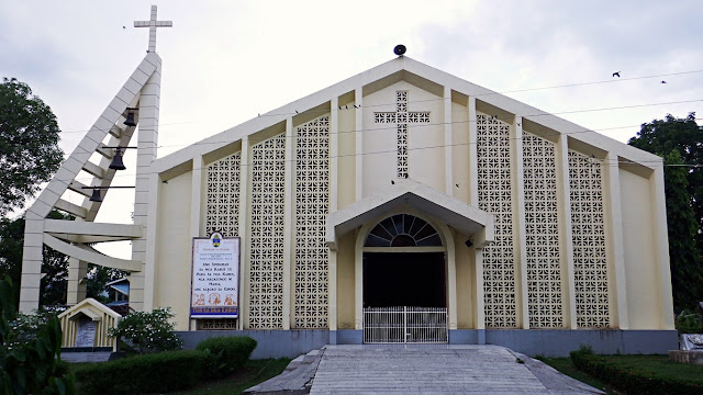
Hinunangan Church
The "Saints Peter and Paul Catholic Parish Church", or "Hinunangan Church for short.Simple, no-frills, clean, therefore 'a nice one'! From my extensive 'sightings' of so many churches in this country though, I can say, this church is rather "newer" than I would have expected - if compared/contrasted to so many old but still standing houses in this town.
I wonder what the history is. Why is this "new"? Sige, I will research on this soon!
For now, this visit I mean, I was happier just admiring the simplicity of this edifice. First thing I noticed is that rampway. There are even no stairs, actually. Hello to the church in MacArthur, Leyte. Ramp like this, not stairs, since many who go to any church are seniors!
Look at how they 'designed' the façade wall. That is just one type (or style, whatever it is called) of a simple (inexpensive) decorative hollow block. Yet the effect is classy elegant!
The paint is divinely subdued too. Not loud. Pleasing to the eyes whether new or faded. And, I love the stylish rendition of that bell tower. Hmm, have I seen that somewhere?!
Hey and aha! I saw something (lower right corner of picture above), and this is it...Whoa! This tile slab (can we call it epitaph?) at center says it all, and let me quote that: "This Franciscan insignia is a remnant of the old church that was built in 1853. This is in remembrance of the Franciscan Missionaries, one of the first evangelizer of Hinunangan".
So that explains it, this is a "newer build" that stands now. The original is gone. But nice of the parish to have picked those three pieces of "remnants" from the original church. Those are carvings on stone, common to many old churches all throughout the country.
I went inside of course, and this is how it looks from the entrance door...Serenely simple... very conducive to praying and meditation, right? No artsy paintings or bling blings to distract the prayerful. And come to think of it, I just realized now... it is actually better if there are no chandeliers or whatever things dropping from the ceiling.
Oh well, this white marble thing near the door does ruin the wonderful view. It does not seem to belong there whether by form or function. What is that, a stoup? If so, ang laki naman! There are other smaller and better alternatives like the ones at Guimbal Church or Paoay Church. Now, if that is supposed to be a baptismal font, ang liit naman! And not many folks would like their babies being christened away from the altar! Just a thought.
Anyway, I like, and love the simplicity, therefore serenity of this church.
==========================================
Click these numbers for a chronology of my notes:
01
02
03
04
05
06
07
08
09
10
11 12 13 14 15 16 17 18 19 20
21 22 23 24 25 26 27 28 29 30
31 32 33 34 35 36 37 38 39 40
==========================================
Or just click "Newer Post" or "Older Post" below.
I wonder what the history is. Why is this "new"? Sige, I will research on this soon!
For now, this visit I mean, I was happier just admiring the simplicity of this edifice. First thing I noticed is that rampway. There are even no stairs, actually. Hello to the church in MacArthur, Leyte. Ramp like this, not stairs, since many who go to any church are seniors!
Look at how they 'designed' the façade wall. That is just one type (or style, whatever it is called) of a simple (inexpensive) decorative hollow block. Yet the effect is classy elegant!
The paint is divinely subdued too. Not loud. Pleasing to the eyes whether new or faded. And, I love the stylish rendition of that bell tower. Hmm, have I seen that somewhere?!
Hey and aha! I saw something (lower right corner of picture above), and this is it...Whoa! This tile slab (can we call it epitaph?) at center says it all, and let me quote that: "This Franciscan insignia is a remnant of the old church that was built in 1853. This is in remembrance of the Franciscan Missionaries, one of the first evangelizer of Hinunangan".
So that explains it, this is a "newer build" that stands now. The original is gone. But nice of the parish to have picked those three pieces of "remnants" from the original church. Those are carvings on stone, common to many old churches all throughout the country.
I went inside of course, and this is how it looks from the entrance door...Serenely simple... very conducive to praying and meditation, right? No artsy paintings or bling blings to distract the prayerful. And come to think of it, I just realized now... it is actually better if there are no chandeliers or whatever things dropping from the ceiling.
Oh well, this white marble thing near the door does ruin the wonderful view. It does not seem to belong there whether by form or function. What is that, a stoup? If so, ang laki naman! There are other smaller and better alternatives like the ones at Guimbal Church or Paoay Church. Now, if that is supposed to be a baptismal font, ang liit naman! And not many folks would like their babies being christened away from the altar! Just a thought.
Anyway, I like, and love the simplicity, therefore serenity of this church.
11 12 13 14 15 16 17 18 19 20
21 22 23 24 25 26 27 28 29 30
31 32 33 34 35 36 37 38 39 40


Comments
Post a Comment